
Manually analyzing spreadsheet datasets can consume hours of your time. However, AI can handle all of this surprisingly quickly and efficiently. For example, Claude can analyze your Google Sheets or Excel spreadsheets faster than traditional methods—generating formulas, charts, insights, and automation—all from simple prompts.
These prompts work best for sales data, financial reports, marketing analytics, inventory tracking, KPI dashboards, and business operations. Claude AI automatically understands your spreadsheet structure and delivers the results instantly.
Below are 7 Claude prompts to analyze Google Sheets and Excel data like a senior analyst.
Table of Contents
7 Claude Prompts to Analyze Your Google Sheets/Excel Data
First, upload your spreadsheet or copy and paste your datasets to Claude. The below prompts work with free version of the AI.
1. Business Data Analysis
[Prompt]Analyze this spreadsheet as a senior business analyst. Identify: (1) what the data represents, (2) key trends and patterns, (3) anomalies or outliers, (4) missing or incomplete values, (5) potential data errors, and (6) high-level business insights that could drive decisions.
Why this works: Breaks analysis into discrete, searchable components rather than one long list.
2. Excel Formula Generation
[Prompt]Generate the specific Google Sheets (or Excel) formulas I need for this dataset. For each calculation, provide: (1) the exact formula, (2) what it does, (3) step-by-step explanation, (4) which cells to apply it to. Include: growth rates, profit margins, forecasts, averages, VLOOKUP/XLOOKUP, INDEX-MATCH, SUMIF, IF statements, and any conditional logic required.
Why this works: Specifies formula types upfront and requests structured explanations for each.
3. Data Cleaning & Quality Assessment
[Prompt]Act as a data cleaning specialist. Scan this spreadsheet and flag: (1) duplicate rows or entries, (2) inconsistent formatting (mixed cases, spacing, date formats), (3) missing or null values, (4) broken or circular formulas, (5) statistical outliers, (6) data type mismatches. For each issue, suggest a specific correction or removal strategy.
Why this works: Prioritizes detection before solutions, making fixes systematic.
4. Strategic Business Insights
[Prompt]Act as a senior strategy consultant analyzing this spreadsheet. Identify: (1) top revenue or growth opportunities, (2) biggest operational or financial risks, (3) hidden trends or correlations, (4) customer or product behavior patterns, (5) key revenue drivers, (6) specific recommendations for growth or optimization. Focus on decisions, not just observations.
Why this works: Shifts focus from data to actionable strategy and decision-making.
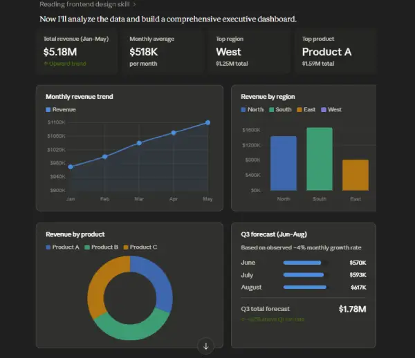
5. Data Visualization & Dashboard Design
[Prompt]Recommend the best charts and dashboard layouts for this dataset. For each visualization, explain: (1) why it's needed, (2) what specific insight it reveals, (3) the ideal chart type (line, bar, pie, scatter, etc.), (4) which data should be included, (5) the key takeaway for an executive audience. Sketch a dashboard layout that tells a cohesive data story.
Why this works: Links visualization choices to business purpose and executive impact.
6. Automated Reporting Workflow Design
[Prompt]Design an automated reporting workflow for this spreadsheet. Specify: (1) which KPIs to track and how often, (2) alert thresholds (when to notify), (3) recurring reports (daily/weekly/monthly), (4) dashboard structure and refresh frequency, (5) automation tools or native Excel/Sheets features to use, (6) step-by-step setup instructions. Make it scalable and low-maintenance.
Why this works: Transforms a static sheet into a live business system with clear ownership.
7. Executive Summary Presentation
[Prompt]Summarize this spreadsheet for executive presentation. Keep it: concise (1-2 pages), strategic, data-driven, and jargon-free. Include: (1) what the data shows, (2) top 3 opportunities or risks, (3) key performance metrics, (4) specific recommendations, (5) success metrics to track. Format as bullet points with visuals where possible.
Why this works: Enforces brevity and focuses on decisions over details.
Quick Tips for Best Results
- Provide actual data: Paste a sample or anonymized version of your spreadsheet for more precise responses.
- Stack prompts strategically: Use prompt #1 (analysis) first, then layer in #4 (strategy), #5 (visualization), or #6 (automation).
- Be specific about your goal: Mention if you’re forecasting, optimizing costs, tracking KPIs, or identifying fraud—it shapes the analysis.
- Request output format: Ask for formulas in a copyable format, insights in a specific structure, or recommendations ranked by impact.
What to Check Before Sharing a Spreadsheet with Claude
- Data sensitivity: Remove genuinely sensitive information like social security numbers, bank details, or unnecessary personal data. Apply the same caution you’d use with any third-party tool.
- Data cleanliness: Fix obvious issues: blank rows/columns, inconsistent formatting, duplicates, and unexpected characters. Clean data produces better analysis.
- Column headers: Use clear, descriptive column names (e.g., “Q2 Revenue” instead of “Data 1”) to speed up analysis and improve accuracy.
- Data scope: Include only relevant data for your specific question. Exclude unrelated historical records or tangential information that slows processing.
- File format: Use Google Sheets, Excel, or CSV formats. Verify the file opens normally on your end and isn’t corrupted before sharing.
Conclusion
Manual spreadsheet analysis drains time and introduces human error. By using Claude with these structured prompts, you can automate insights, generate formulas, clean messy data, and transform raw numbers into strategic decisions—all in minutes. Start with the prompt that matches your immediate need, then build a complete analysis workflow. The result: faster decisions, fewer errors, and time back in your day.