
You’ve got a spreadsheet with hundreds or thousands of rows. Maybe it’s sales data, customer records, or inventory logs. You know there are patterns hiding in there, but finding them manually? That’s a nightmare.
This is where pivot tables come in. They’re essentially your data’s best friend—automatically organizing messy information into clean, digestible summaries so you can spot trends without pulling your hair out. To make your Google Sheets better, you should learn how to use pivot tables. This guide makes it simple and easy to understand.
Table of Contents
What Exactly Is a Pivot Table?
At its core, a pivot table is a tool that reorganizes and summarizes your data into a format that’s actually useful. Instead of staring at raw numbers, you get totals, averages, counts, and other summaries grouped the way you want them.
Here’s a concrete example: Say you’re running an online store and have a spreadsheet with every transaction—dates, products sold, revenue amounts. Normally, you’d have to manually group and add up everything by product, by month, or by both. A pivot table does this instantly. Want to know which product brought in the most revenue in May? Done. Want a breakdown by both product and month? Also done.
The beauty? You could technically get these same insights using formulas, but a pivot table gets you there in a fraction of the time with way fewer chances for mistakes.
How to Create a Pivot Table? The Easy Route: Let Gemini Build It For You
If manual configuration sounds tedious, you can actually ask Gemini to create your pivot table for you. Just tell it what question you want answered—something like “Show me total revenue by product category for May 2026″—and it builds the whole thing automatically, including a summary of what it did.
This is genuinely the fastest option if you’re comfortable letting AI handle the setup.
How to Build a Pivot Table Manually (It’s Easier Than You Think)
If you want to stay in control or just understand how it works, here’s the step-by-step process:
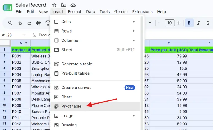
Step 1: Select Your Data
Highlight your entire dataset, including column headers. If your columns don’t have names yet, add them first—pivot tables need headers to work.
Step 2: Insert a Pivot Table
Click Insert → Pivot table. A panel will pop up asking if you want the pivot table in a new sheet or an existing one. Choose your preference and click Create.
Step 3: Configure Your Pivot Table
Now you’ll see the Pivot Table Editor with four key sections to fill in:
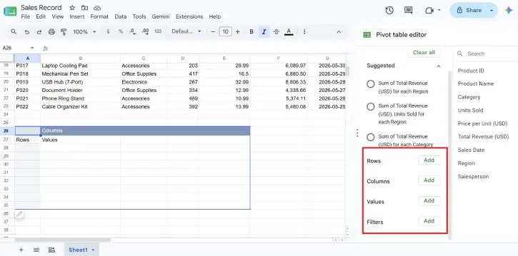
Rows — Pick which column you want running down the left side. Google Sheets will list every unique value from that column. (Example: product names)
Columns — Pick what you want spreading across the top. Each unique value becomes its own column header. (Example: product categories)
Values — Choose what numbers appear in the grid itself—and how to display them. You can show sums, averages, counts, and more depending on your data. (Example: total revenue)
Filters — Optionally narrow down which data gets included. (Example: only show sales from May 2026)
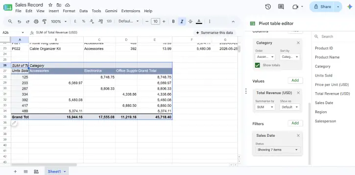
That’s it. You now have a working pivot table that answers your questions without the manual grind.
ALSO READ: How to Use the IMPORTRANGE Formula in Google Sheets
How to Keep Your Pivot Table Up to Date
Made changes to your original data? Your pivot table should automatically update when you refresh the page. Might take a minute or two if you’ve got tons of data, but it happens without you lifting a finger.
Here’s the catch: if you’ve added new rows or columns to your source data, just refreshing won’t cut it. You need to update the pivot table’s data range to include those new columns.
To do this:
- Hover over your pivot table and click Edit
- Click the Select data range icon at the top
- Enter your new, expanded data range
- You’re done—it’ll now pick up the new data
FAQ
Q: Can I create multiple pivot tables from the same data?
A: Absolutely. You can create as many pivot tables as you want from a single dataset. Each one can show different groupings and summaries.
Q: What if my pivot table isn’t showing the insights I expected?
A: Try switching which fields go in Rows, Columns, and Values. Sometimes rearranging gives you the perspective you need. If you’re stuck, Gemini can help you brainstorm the right configuration.
Q: Do pivot tables work with live data?
A: Yes, but there’s a slight delay. Changes to your source data will eventually show up in the pivot table, though it might take a minute depending on your dataset size.
Q: Can I edit a pivot table after creating it?
A: Yes. Click Edit on the pivot table to adjust which fields appear where, change how values are calculated, or add/remove filters.
The Bottom Line
Pivot tables transform raw data into actionable summaries. Whether you use Gemini to build them automatically or configure them yourself, they’re one of the most powerful features in Google Sheets for anyone working with large datasets. You’ll save hours of manual sorting and spotting patterns becomes almost effortless.